I’m bank switching to see if I like any bank as much as Starling, to nosy around some snazzy banking apps and to get the switch offer money. This time is Santander, I got £100 and really didn’t love the app.

Table of Contents
Application etc
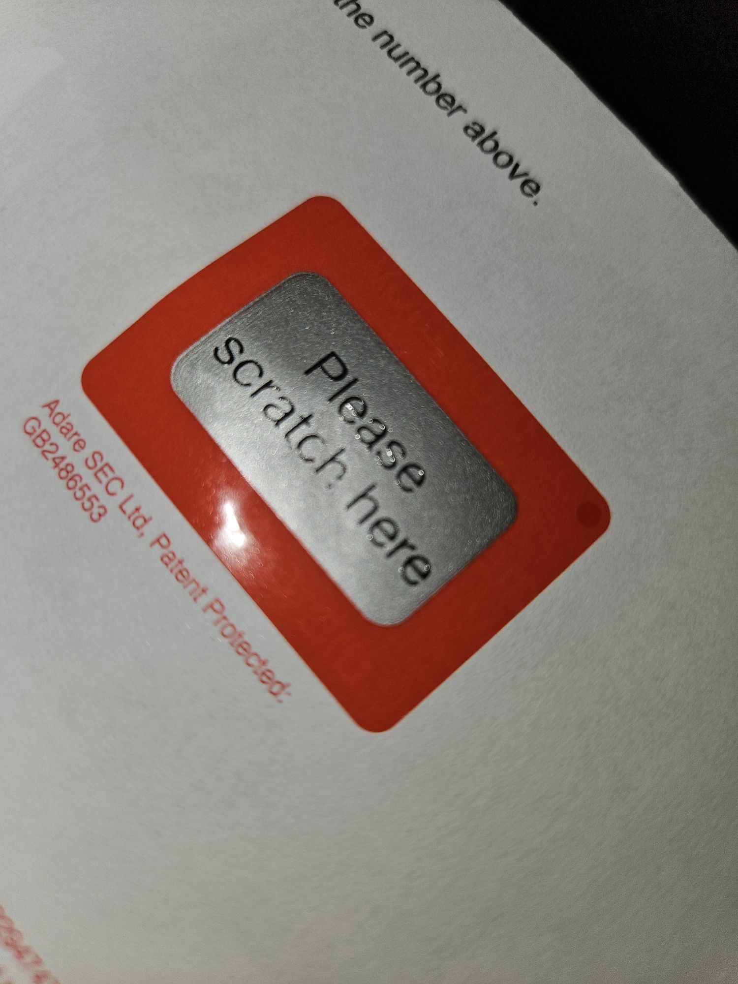
Set-up was initially smooth and pleasant, like the coop they allowed Mx but ask for Male or Female Gender as a binary. There was not much paper sent out initially, which was great, just the basic card and pin. However, the pin was scratch to reveal and not a simple peel which I personally found much less accessible.
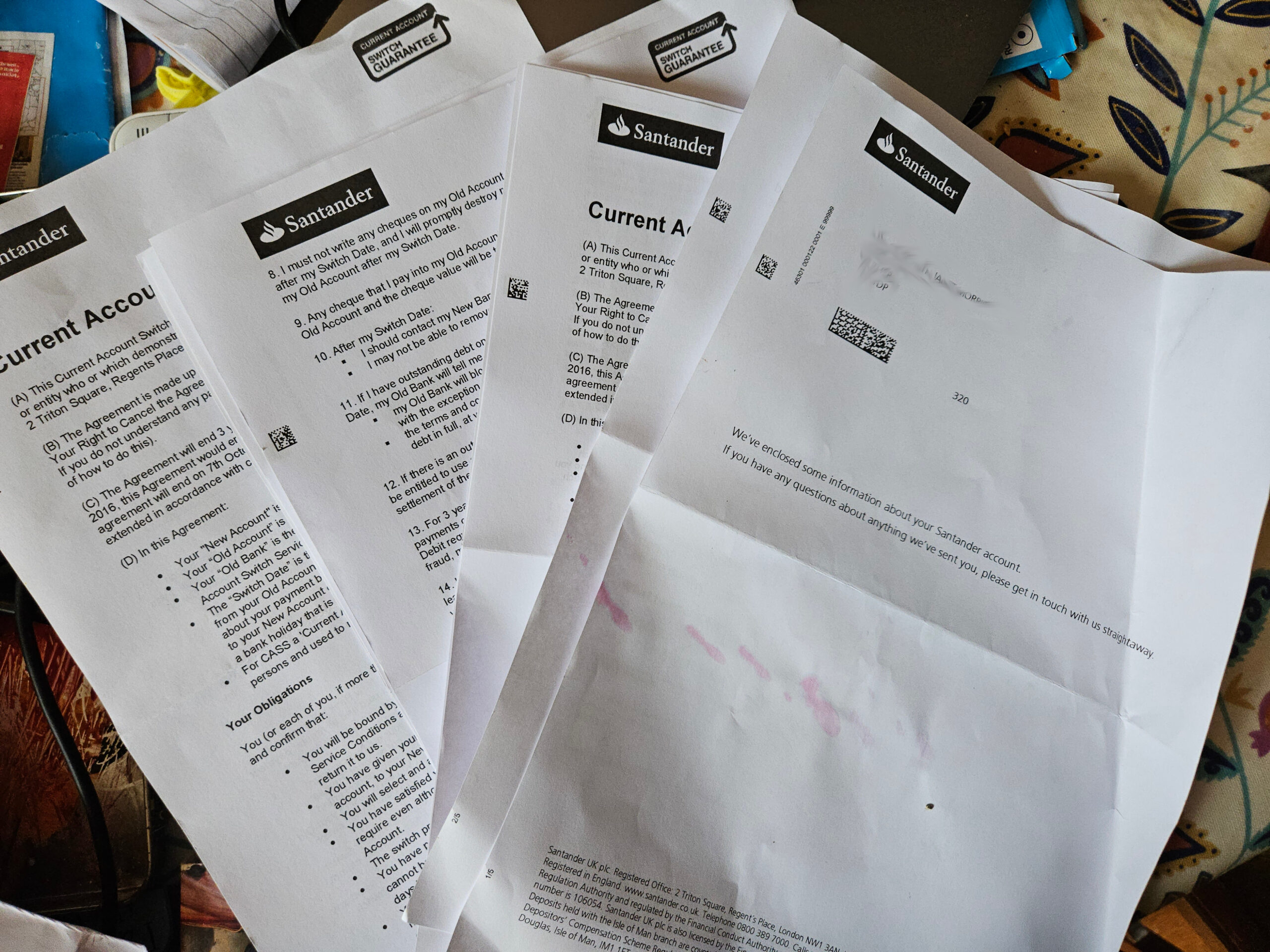
Then later a whole bunch of documenters arrived by post – BOOO!
Setting up the App was a chore
Setting up on the app was annoying and confusing. As I wasn’t sent any info about setting up on-line my money was moved from coop to Santander with no obvious way to access my account. I figured out how to register for on-line banking myself and was sent two letters which took a week to arrive.
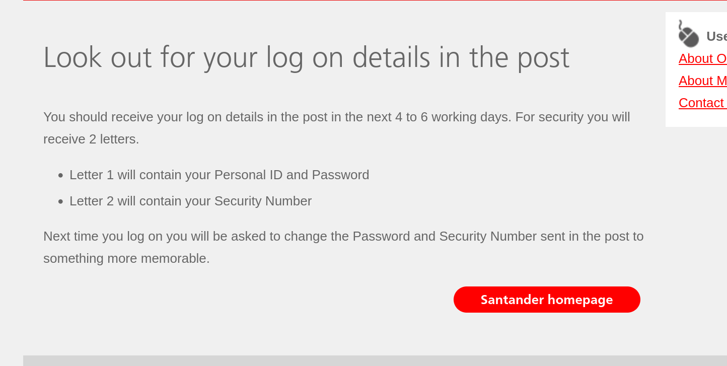
When they arrived, I couldn’t log on in the app with the info given, it threw up an error about my mobile not being registered and they needed to send a passcode.
I went to the website instead where I was able to log on with only one of the bits of info from the two letters: I only needed the temporary security number and never used the temporary password in second letter. And my mobile number was registered, the the app error was just an error!
The personal ID they provide is 10 digits presented with no spaces or hyphens which, as a sleep deprived dyslexic, took me 9 tries to enter correctly between the app and the website attempts. Then I needed mobile code and email link (not just code) after the pin, password and personal ID. Its just… a lot.
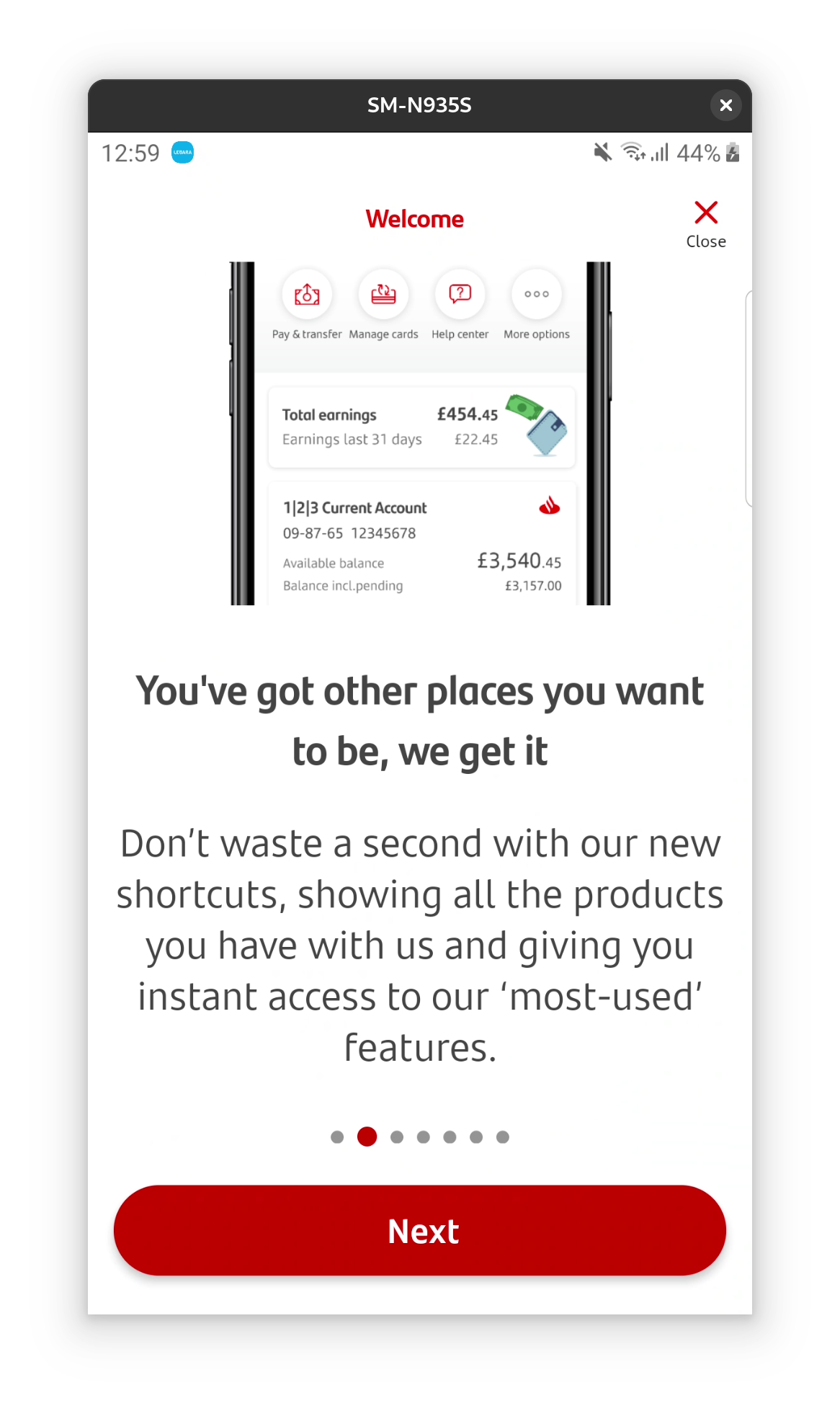
On-boarding was okay
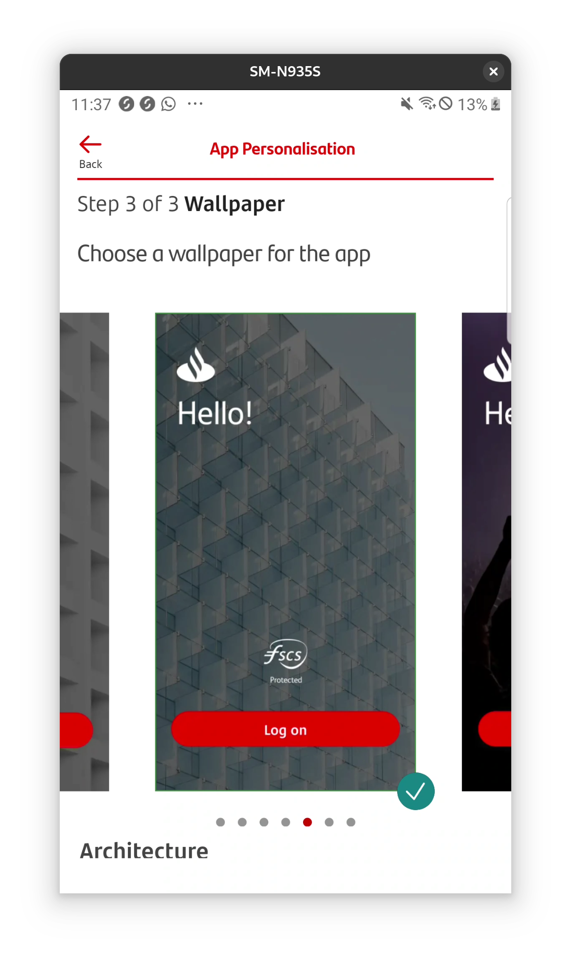
On-boarding to the app is nice once logged in.
You’re prompted to set up notifications and biometrics, no pin protection is mentioned (biometrics don’t work well for me) but actually the default is pin if you don’t enable biometrics. There is a nice wallpaper selection for the log in screen, not sure it’s my top priority, but I’ll take it.
Initial impressions
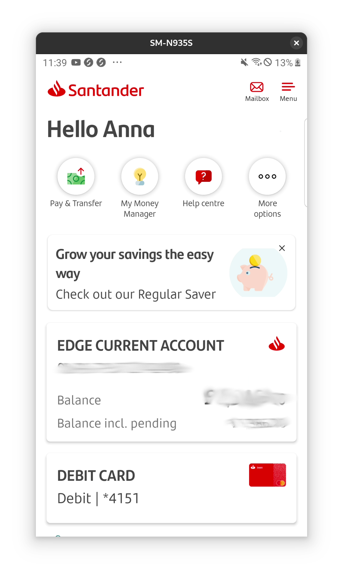
The app interface is bright and clean with icons. The card is shown along side the account.
Menu mayhem
I found the app interface kind of horrible, it took me while to figure out why. I think, basically, that the navigation hasn’t been designed all at one, but piecemeal over time. For example, several options are duplicated or almost duplicated but not quite, and I don’t find the order logical also.
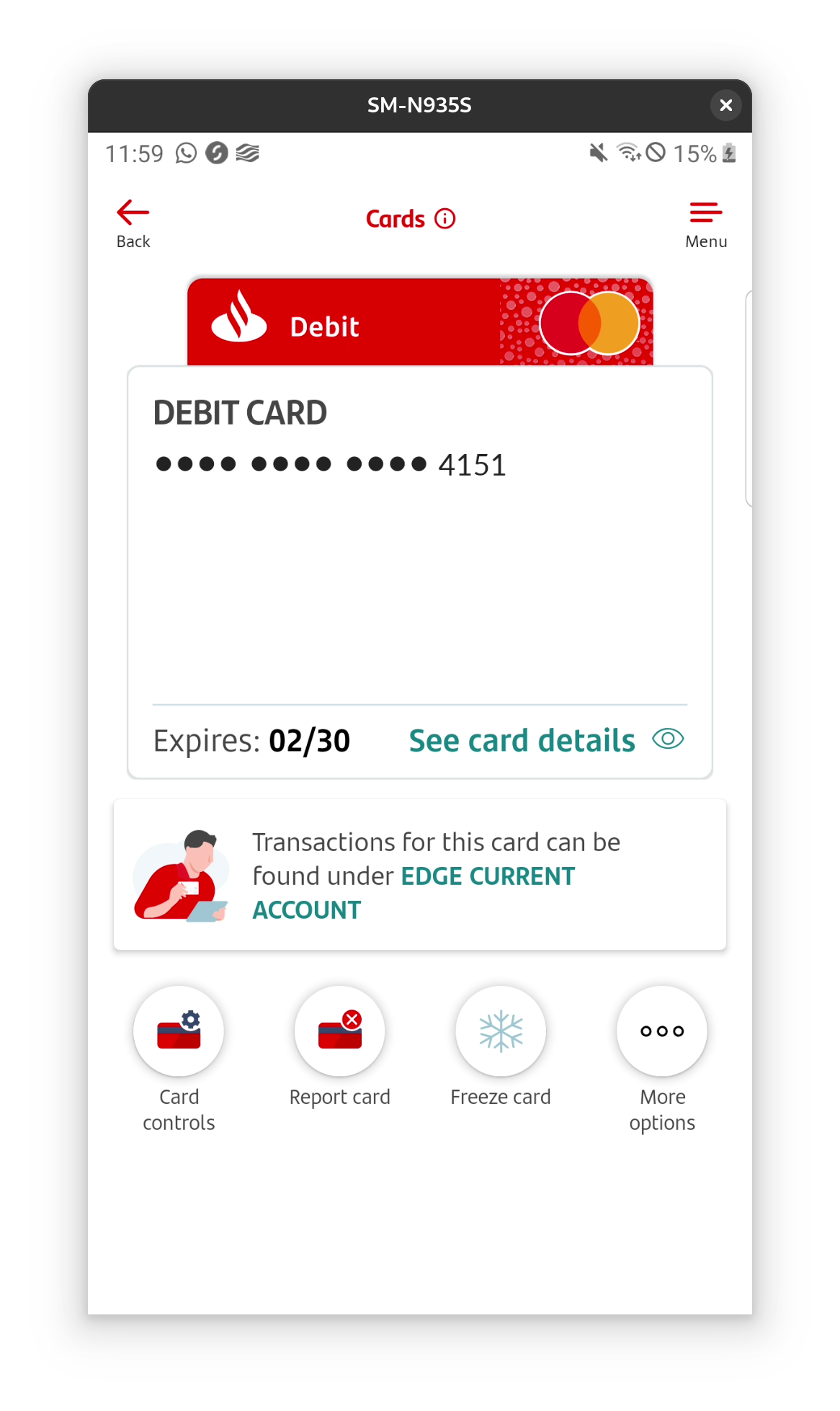
View card, manage card and tapping the card on the home screen all take you to the same screen (at least if you only have one card it looks the same).


Another example are these icons on the home screen of the app.

They are partly duplicated on the account screen of the app, with the first and the last being the same – however they have different functions and display options when tapped.
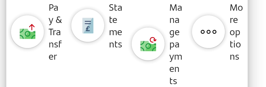
For example pay and transfer on the home screen gives pay, transfer and pay in cheque and also manage direct debits, standing orders etc. Whereas pay and transfer on the account screen only gives the first three: pay, transfer and pay in cheque.
Also, the more options button on each of the two menus brings up different options for each screen even though the icons are the same and location on the screen is the same.
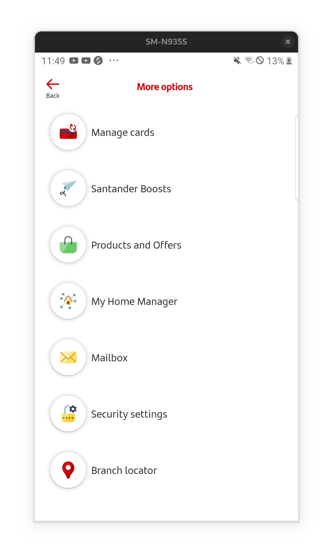
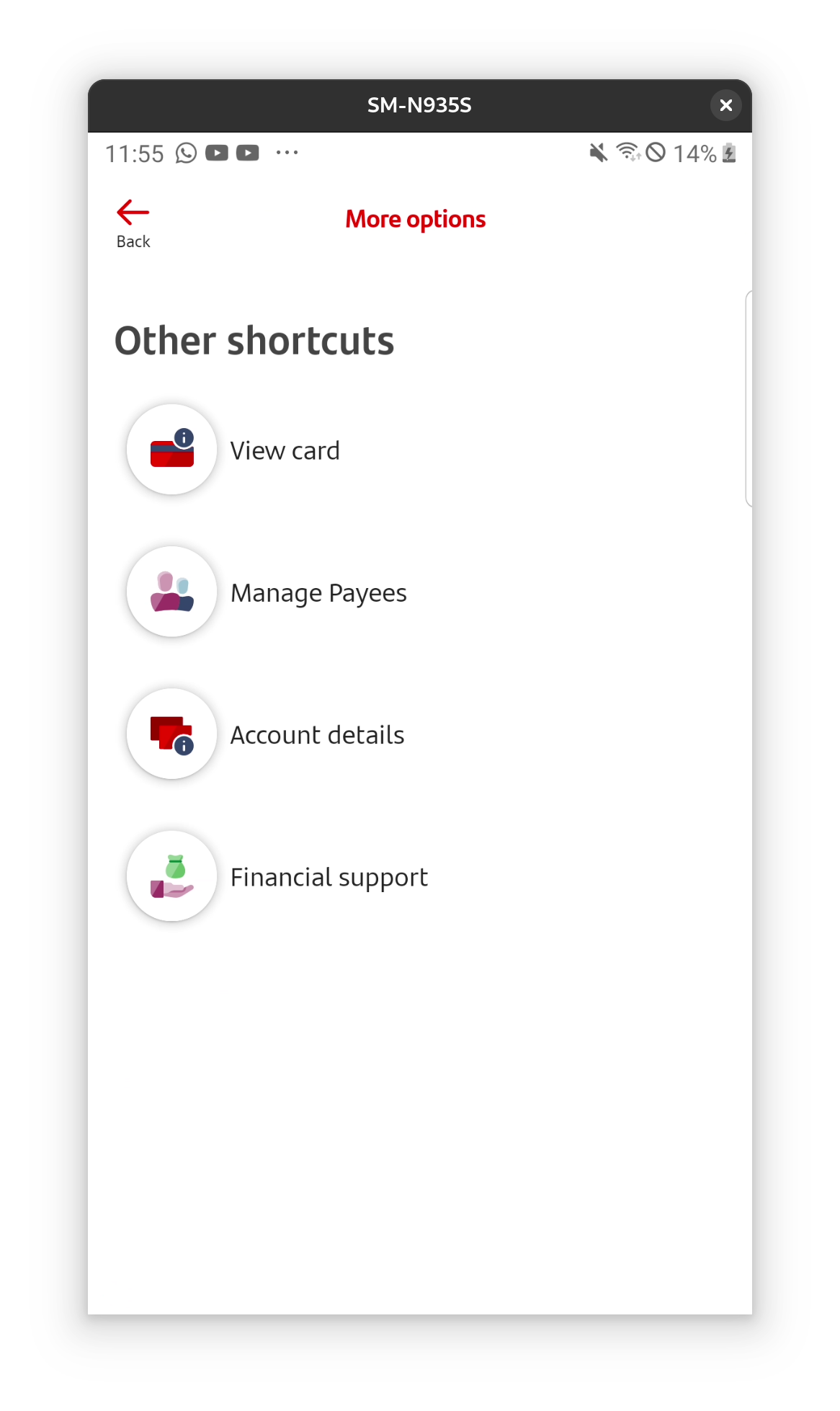
There is a hamburger menu at the top of all screens with links that are also found under more options, including settings (with nested security and app settings), money manager, products and offers. There is also a mailbox icon next to the hamburger menu and that is on the sub menus too. It’s just a bit of a mess.
They seem to be proud of these scatter-gun short-cuts and menus, they mention them in on boarding even. Best case scenario these are short cuts that work well if you have multiple accounts, worst case it’s just haphazard development.

Good things
Unlike with coop stander had some security when making large payments to existing saved account – which I think is a good thing. I had to put in my pin etc to move money. I also like that it’s usually clear when you’re leaving the app to visit e.g. the Santander website or another app – though the warning didn’t always trigger so I didn’t get a screenshot.
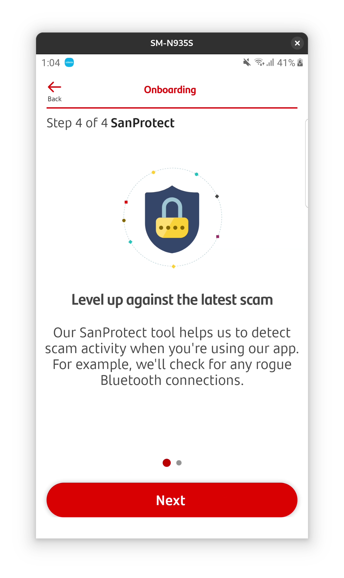
There is also a feature called SanProtect which might be a good thing: it seems to be additional security features for the banking app. However it requires permissions to make and manage calls and find and connect nearby devices – and I didn’t want to give that permission without more information.
Some accessibility features are font an centre, for example text size can be varied and this is announced in on boarding. This is reassuring.

More annoying things
There are no notifications of money spent or incoming, which drives me mad! Even when I got my £100 switch offer paid, for example, I wasn’t notified and this caused total chaos. I ended up spending the money without realizing and it took me to unpick what the extra money wa and where it money had gone.
Like with co-op, going overdrawn just sends me a text message after the fact. And similarly the order of transactions is also confusing, with dates and times not reflecting when I actually paid, but the date the money cleared. This is just so annoying to me.
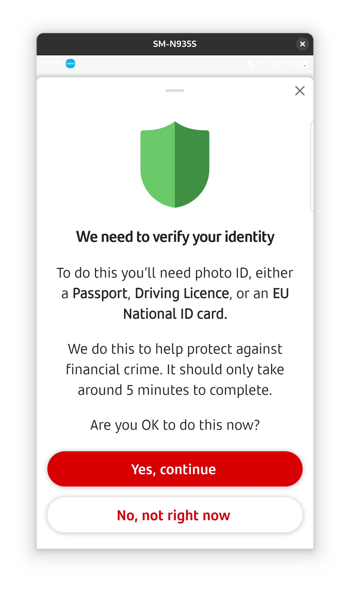
The app makes a huge deal about showing you your pin, with three steps including a text message. The app won’t even show me my card number without me uploading ID. I find this a bit ridiculous. I use the show my pin and show my card details constantly on starling and I haven’t had this issue with any other bank.

Also again with the random menus: the see card details button takes you directly to verification screen below, but there is a separate menu item lower down that gives a different screen with some details shown and not others. It’s just messy.
Can’t enable screenshots temporarily, which is annoying.
And finally it makes duplicate payees with every new reference, very annoying, same as co-op.


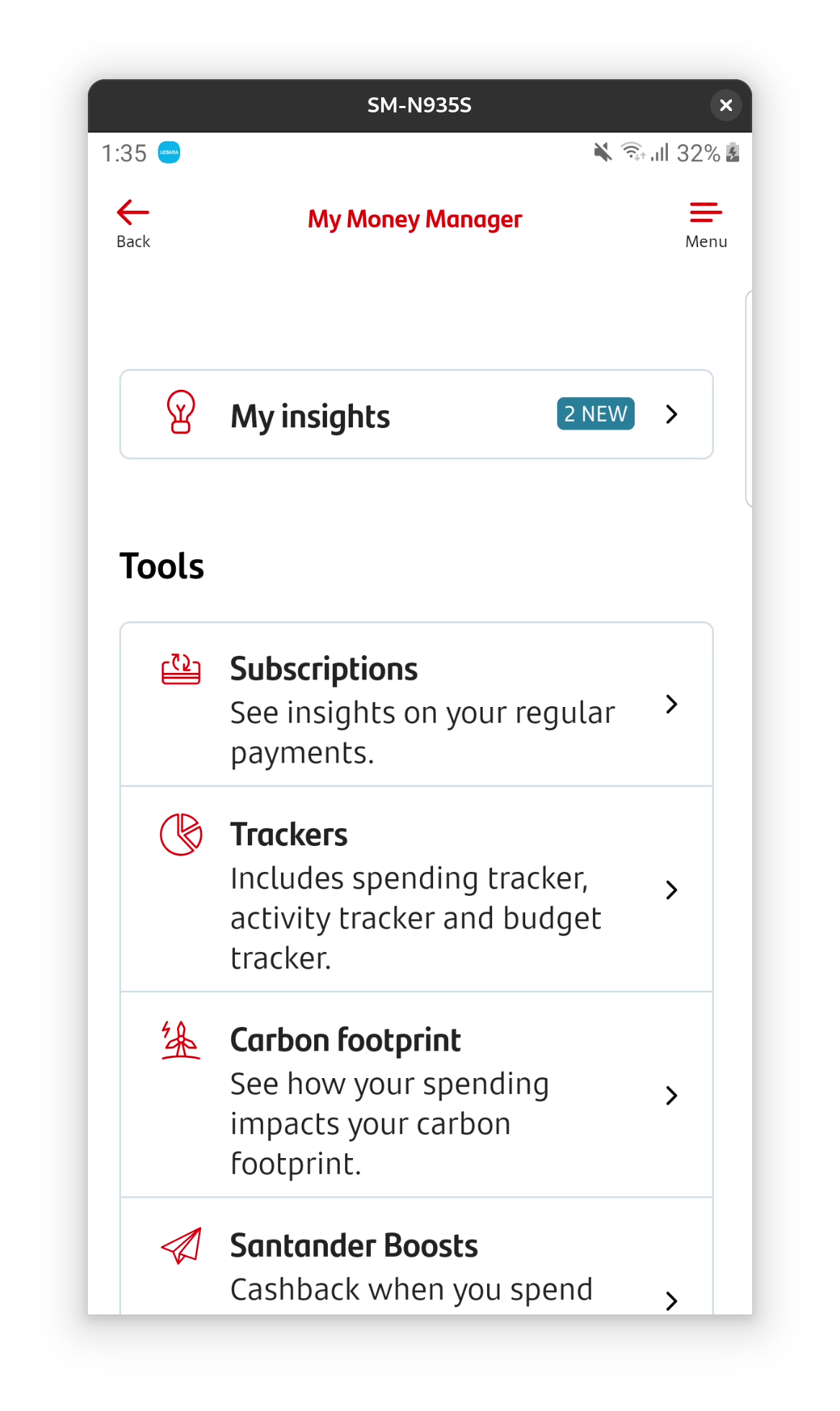
Money manager
I didn’t use this huge feature of the app at all, I wasn’t aware it existed for most of the time. Then I wasn’t clear what the function was, as they also have something called home manager which I wasn’t keen to use. Having finally enabled it, this seems to be budgeting and tracking bills month to month. It even has a carbon footprint section, which is something I’ve worked on before and am excited to see.


However, I don’t think I am going to use this account enough to fairly judge this feature. I am 100% sure that I don’t want to permanently move to Santander. I need notifications of money coming in/out, easy access to my card details and pin, and better organisation to transactions and payees. Without this I’m not in control of my money in real time, and no matter how good the budgeting is, I would always be having to work harder to make up for this basic missing info.
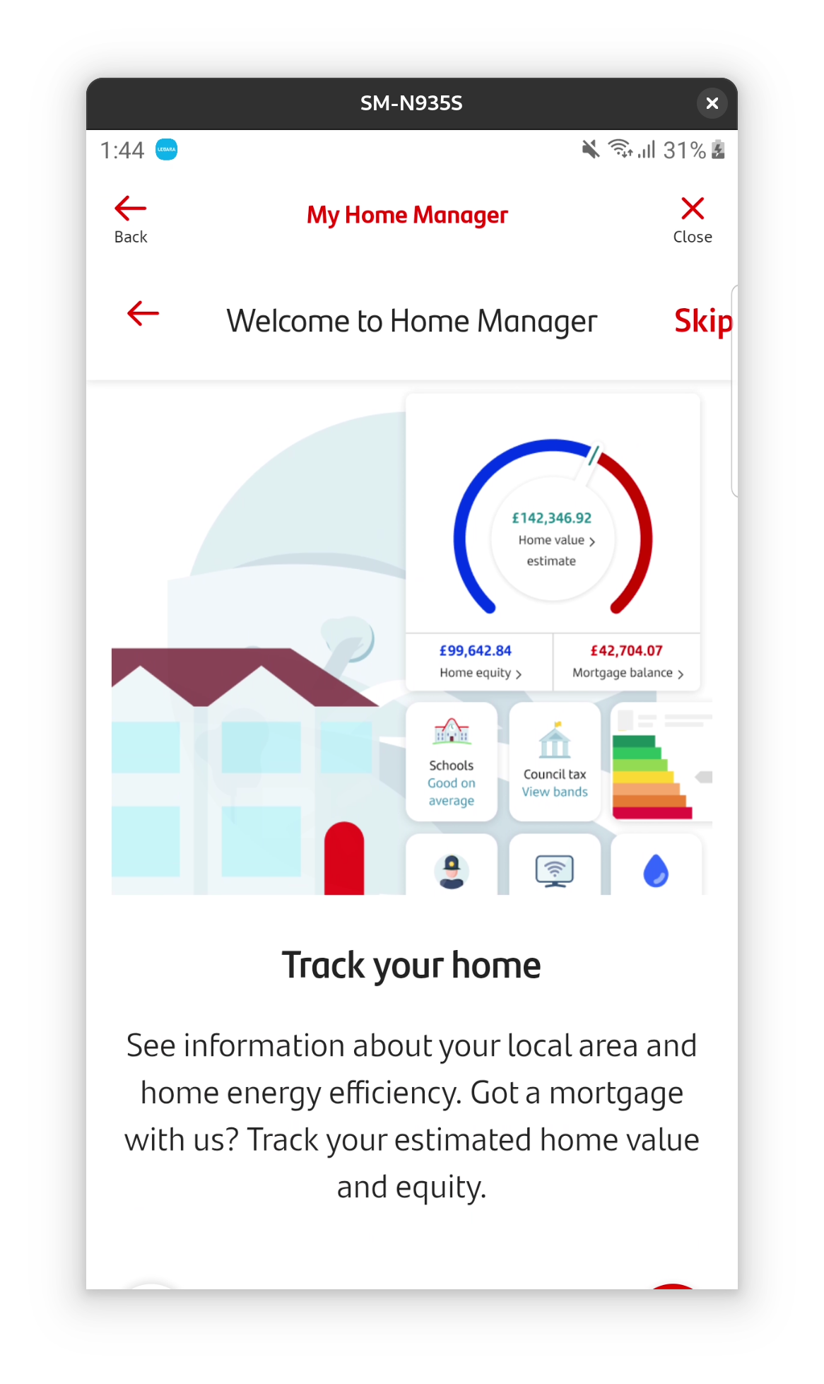
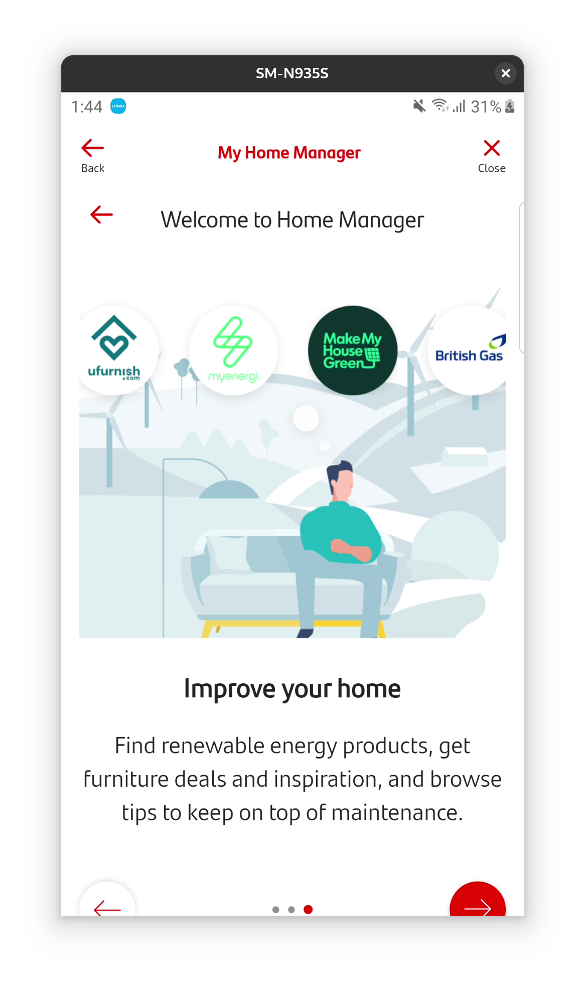
My home manager
Looks creepy, sorry.

Actually paying to maintain this account – why?!
This account costs £3 a month to have! I don’t think it’s worth it, Starling is free and does better. Moving on to Nationwide!